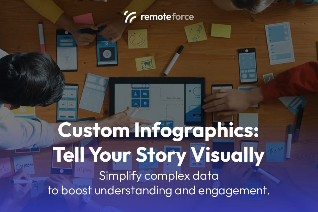
In a world saturated with information, capturing and holding your audience’s attention is a constant challenge. Walls of text, complex data, and detailed reports can be overwhelming and lead to high bounce rates. But what if you could simplify complex data into a visually stunning, easy-to-digest format that tells your story in seconds? This is the power of custom infographic design.
If you want to simplify complex data with stunning infographics, you need to understand how visuals improve understanding and engagement. Infographics are a powerful tool for marketing, education, and content strategy, making your message memorable and shareable. Click to learn how this design method can enhance your content strategy and set your brand apart!
Key Takeaways
Infographics are strategic visual assets designed to make complex information digestible, shareable, and highly effective for SEO and brand authority.
- Visual Superpower: Leveraging the fact that humans process visuals 60,000 times faster than text, infographics boost comprehension and retention dramatically.
- SEO Asset: High-quality, original infographics are highly linkable assets, making them magnets for backlinks that drive crucial organic traffic and improve search rankings.
- Format is Strategy: The success of an infographic depends on choosing the correct type—a Timeline for history, a Process Chart for instructions, or a Comparison for product choice.
- Maximise ROI: To get the best return, the full infographic should be broken down into bite-sized visual snippets for distribution across all social media and email platforms.
The Power of Visual Storytelling
Human brains are hardwired to process visual information faster than text. According to the Social Science Research Network, 65% of the population are visual learners. We can process visuals 60,000 times faster than text, and content with relevant images gets 94% more views than content without.
Infographics leverage this natural inclination by combining data, text, and imagery into a compelling narrative. They make a brand’s message more accessible, persuasive, and memorable, transforming dry statistics into an engaging visual experience.
5 Reasons Why Custom Infographic Design Is a Game-Changer

1. Simplifies Complex Data
Infographics excel at breaking down complicated information into digestible chunks. Whether you’re explaining a complex process, presenting market research, or showcasing a multi-step guide, an infographic can replace lengthy paragraphs with a logical flow of icons, charts, and diagrams. This clarity not only improves comprehension but also positions your brand as an authoritative expert in its field.
2. Boosts Engagement & Retention
Content with visuals is more likely to be read and shared. Infographics stand out on social media feeds and blog posts, grabbing attention immediately. More importantly, they help with information retention. Studies have shown that people remember 80% of what they see and do, compared to just 20% of what they read.
- Unique Insight: A well-designed infographic can significantly increase the time a user spends on your page, a key metric for both SEO and understanding user interest.
3. Enhances Brand Awareness
A high-quality, custom infographic with your brand’s colors, logo, and typography reinforces your visual identity. When your infographic is shared across the web, it carries your brand with it, acting as a powerful piece of brand-building content. This is a form of passive marketing that continually works for you.
Also Read: How Animated Graphic Design Brings Your Brand to Life
4. Improves SEO & Drives Traffic
- Backlinks: Infographics are a highly linkable asset. Other blogs and websites are often eager to share valuable visual content, and when they do, they’ll often link back to your original source. These backlinks are a crucial ranking factor for search engines.
- Social Shares: Infographics are among the most shared types of content on social media. Each share increases your content’s reach and can drive direct traffic to your website.
- Image Search: A properly optimized infographic (with a descriptive file name and alt text) can rank in Google Image Search, opening up a new channel for organic traffic.
5. Versatility Across Platforms
A well-designed infographic can be repurposed for multiple channels, maximizing its value.
- Blog Posts: Embed it in a detailed article to break up text and provide a visual summary.
- Social Media: Share it as a single, long image or break it into smaller, bite-sized visuals for platforms like Instagram, Pinterest, and Facebook.
- Email Newsletters: Use it as a key visual to drive traffic to a full blog post.
- Presentations & Reports: Integrate it into slide decks to make your data more compelling and professional.
What Goes into an Effective Custom Infographic?
Creating a great infographic goes beyond just putting images and text together. It requires a thoughtful design process:
- Clear Narrative: What is the one key story you want to tell? Every element should support this central message.
- Data Accuracy: Your information must be well-researched, accurate, and properly cited. The credibility of your infographic depends on it.
- Logical Flow: The viewer’s eye should naturally move from one point to the next, following a clear beginning, middle, and end.
- Brand Consistency: The design, colors, and fonts should align with your brand’s style guide.
- Visual Hierarchy: Use size, color, and placement to guide the viewer’s attention to the most important information first.
- Whitespace: Don’t clutter the design. Giving your elements room to breathe makes the infographic easy on the eyes.
The Content Strategy: Choosing the Right Infographic Type and Maximizing Distribution
Creating a custom infographic is only the first step. To ensure it achieves maximum reach and meets your business objective, you must align the data structure with the correct visual type and execute a strategic distribution plan.
1. Choosing the Right Infographic Type
Different stories require different visual frameworks. Choosing the wrong type can confuse the audience or weaken the impact.
| Infographic Type | Best Used For | Example Use Case |
| List-Based | Presenting a sequence of tips, facts, or resources. | “7 Ways to Improve Your E-commerce Conversion Rate.” |
| Timeline | Showcasing historical data, milestones, or a plan’s evolution. | “The 50-Year History of Singapore’s Digital Economy.” |
| Process/Flow Chart | Explaining a multi-step service, internal workflow, or user journey. | “How Our Application Approval Process Works (Step-by-Step).” |
| Comparison/Versus | Highlighting the pros and cons of two products or services. | “In-House SEO Team vs. Outsourced Agency: Which is Right for You?” |
| Data Visualization | Focusing on charts, graphs, and statistics, often with heavy number use. | Presenting complex market research findings or survey results. |
2. Maximizing Distribution for Reach and SEO
A great infographic is a gift to your marketing team, but it must be actively promoted to gain traction.
- Blogger Outreach: Identify websites and industry blogs that regularly cover your topic. Email them a concise summary and a high-quality snippet of the infographic, inviting them to embed it on their site (and link back to your source).
- Social Media Snippet Breakdown: Do not post the full, long infographic as one image. Break it down into 3-5 individual, square-cropped sections and release them over a week on platforms like LinkedIn and Instagram to create a content series.
- Pinterest Optimisation: Use the full-length infographic image (or a dedicated vertical snippet) and post it to Pinterest. Since Pinterest acts as a visual search engine, this is an excellent, often overlooked, channel for driving long-term, passive referral traffic.
Conclusion: Transform Your Content with Strategic Design
In the competitive digital landscape, a great idea is only as good as its execution. Custom infographic design offers a powerful way to cut through the noise, simplifying complex ideas and telling your brand’s story in a visually engaging and highly effective manner.
By investing in this form of visual content, you’re not just creating a graphic; you’re building a shareable, SEO-friendly asset that boosts engagement, drives traffic, and strengthens your brand authority.
While the appeal of infographics is clear, creating a professional, high-quality design that perfectly captures your data and brand identity requires a blend of expertise in data visualization, content strategy, and graphic design. At RemoteForce, we specialize in comprehensive graphic design services, including the creation of stunning, custom infographics.
Our team of experienced designers works with you to transform your data into compelling visual narratives that are designed to engage your audience and enhance your digital marketing efforts.
Beyond graphic design, RemoteForce also offers digital marketing, secretarial, legal, web & app development, and accounting services, providing a holistic suite of solutions to empower your entire business.
Ready to simplify your data and enhance your content strategy with a custom infographic? Contact RemoteForce today for a personalized graphic design consultation! Get in touch with us today on LinkedIn or Facebook!
Frequently Asked Questions (FAQ)
1. How long should an infographic be?
There is no fixed rule, but the best infographics follow an F-shaped reading pattern. For blog posts and websites, a length of 600 to 1,800 pixels wide and 5,000 to 8,000 pixels long is common. The design should prioritize vertical flow and break up the length with clear headers and white space to avoid visual fatigue.
2. What is the ideal image resolution for an infographic?
The image resolution should be high enough for clarity on retina screens (e.g., 150-300 PPI/DPI) but optimized for web loading speed. We recommend delivering the final asset as a high-quality JPEG or PNG file that is compressed to ensure quick load times, especially important for Singapore’s mobile-first audience.
3. How can I measure the ROI (Return on Investment) of an infographic?
Measure ROI by tracking three main metrics:
- Backlinks: The number of unique domains that link to the infographic’s original hosting page (using tools like Ahrefs or SEMrush).
- Traffic: The amount of direct and referral traffic driven to that page (using Google Analytics).
- Social Shares: The number of times the asset is shared across platforms.
4. What is the difference between an infographic and a data visualization?
- Data Visualization is the use of standard charts (bar, line, pie) to present a specific dataset accurately. It is pure data display.
Infographic is a broader term that combines text, icons, data visualizations, and storytelling to convey a specific narrative or educational message. A data visualization is often just one element within a complete infographic.
- How Layout Impacts Conversions: The Science Behind Design That Sells - February 11, 2026
- What Is Visual Hierarchy? A Guide to Organizing Design Elements That Guide the Eye - February 11, 2026
- What Is Layout Design? The Foundation of Visual Communication That Drives Results - February 10, 2026