
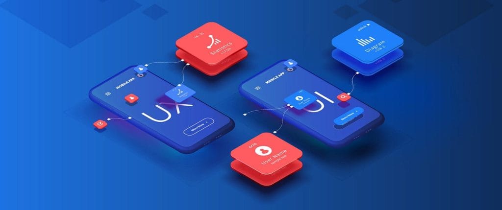
In the crowded app marketplace, an app’s success isn’t just about what it does, but how it feels to use. A user interface (UI) isn’t just the pretty face of your app; it’s the core of the user experience (UX). A truly great app UI is one that goes unnoticed—it’s so seamless and intuitive that users can achieve their goals without thinking.
This article dives deep into the principles of great mobile app UI design, showing you how to create an interface that’s not only visually appealing but also exceptionally intuitive, leading to higher user engagement and retention.
Key Takeaways
Successful mobile app UI design is about making the interface disappear so users can achieve their goals effortlessly. This requires strategic planning, not just aesthetic flair.
- Intuition is King: A great UI leverages familiar design patterns and ensures consistency across all screens, reducing cognitive load and the need for users to ‘learn’ the app.
- The Thumb Rule: Design must accommodate one-handed use. This means maintaining minimum touch target sizes (44×44 pixels) and placing primary actions within the user’s thumb reach (the bottom half of the screen).
- Simplicity Drives Retention: Embrace white space and progressive disclosure (don’t show everything at once). An uncluttered screen improves focus and efficiency, directly leading to higher engagement and retention.
- Platform Matters: The choice between Material Design (Android) and iOS Human Interface Guidelines (HIG) dictates the final look and feel. Deciding whether to maintain cross-platform parity or adhere strictly to native standards is a critical early decision.
What Makes a UI “Intuitive”?
An intuitive UI is one that users can understand and navigate without instruction. It leverages familiar patterns and design principles to make interactions feel natural and effortless.
Here are the key characteristics of an intuitive UI:
- Clarity: The purpose of every element, from buttons to icons, is immediately clear. There’s no ambiguity.
- Consistency: The design language, including colors, fonts, and button placement, remains consistent throughout the app. This predictability builds trust and reduces cognitive load.
- Efficiency: The user can complete tasks with the fewest possible steps. Unnecessary taps and complex navigation are eliminated.
- Responsiveness: The app provides immediate feedback for every action, whether it’s a button changing color on a tap or a loading indicator appearing.
- Familiarity: It uses common design patterns and conventions that users already know from other apps (e.g., a hamburger menu for navigation or a shopping cart icon for e-commerce).
Key Principles of Intuitive Mobile UI Design
Creating an intuitive UI is a blend of art and science. By focusing on these core principles, you can build an interface that users will love.
1. Simplify and De-clutter
The mobile screen is small, so every pixel counts. An overcrowded screen overwhelms users and makes it difficult to focus on what’s important.
- Embrace White Space: Use ample white space (or negative space) to give elements room to breathe. This improves readability and guides the user’s eye.
- Prioritize Content: Place the most important information and actions front and center. Use a visual hierarchy to guide users through the content.
- Progressive Disclosure: Don’t show everything at once. Reveal additional information or options only when the user needs them. For example, a “more” button can hide less-frequent options.
2. Ensure Consistency and Predictability
Consistency is the bedrock of a good user experience. When users encounter a new screen, they should already have a good idea of how to interact with it.
- Visual Consistency: Use the same color palette, typography, and button styles across the entire app.
- Functional Consistency: Buttons and icons should perform the same action wherever they appear. A “heart” icon should always mean “like” or “favorite,” not “share” on one screen and “save” on another.
- Cross-Platform Consistency: While you should adhere to platform-specific design guidelines (e.g., iOS Human Interface Guidelines, Android Material Design), your app’s core identity and functionality should be consistent across devices.
3. Design for the Human Finger
Mobile apps are primarily used with fingers, not a precise mouse cursor. Your design must account for this.
- Ample Touch Targets: Make interactive elements large enough to be easily tapped. The recommended minimum size for a touch target is 44×44 pixels.
- Place Actions Strategically: Place primary actions (like a “confirm” or “buy now” button) within easy reach of the thumb, especially for one-handed use. Avoid placing critical buttons at the very top of the screen where they are hard to reach.
4. Provide Instant and Clear Feedback
Users need to know that their actions have been registered. Without feedback, they might get confused, frustrated, or think the app is frozen.
- Visual Feedback: A button should visually change (e.g., darken or glow) when tapped. A progress bar or spinner should indicate that the app is working on a request.
- Haptic Feedback: A subtle vibration can confirm a successful action, like a button tap or a drag-and-drop completion.
- Textual Feedback: Use toast messages or pop-ups to confirm a success (e.g., “Item added to cart”) or to alert the user of an error.
5. Leverage Familiar Design Patterns
Don’t reinvent the wheel. Users have developed habits from years of using mobile apps. Using established patterns makes your app instantly feel familiar.
- Navigation: Use standard patterns like a tab bar (at the bottom of the screen) for primary navigation, or a side menu (hamburger menu) for secondary options.
- Forms and Input: Follow conventions for forms, like placing labels above input fields and providing clear error messages.
- Icons: Use universally recognized icons (e.g., a magnifying glass for search, a house for home). If you use a custom icon, ensure its meaning is intuitive.
Also Read: Why Progressive Web Apps Are the Future of Web Development?
Case Study: The Success of Airbnb’s UI
Airbnb’s mobile app is a prime example of an intuitive UI. Its success can be attributed to several key design choices:
- Minimalist & Clean: The interface is clean, focusing on high-quality images of properties. Unnecessary clutter is removed, making it easy for users to browse.
- Intuitive Search: The search function is prominent and easy to use. Filters are clearly categorized, allowing users to quickly narrow down their options without confusion.
- Visual Hierarchy: The most critical information property photos, price, and location is always at the forefront, guiding the user’s journey from Browse to booking.
- Consistent Experience: The design language is consistent across the entire app, creating a cohesive and trustworthy experience.
Platform Parity vs. Platform Native: Designing for iOS vs. Android
A critical strategic decision in mobile UI design is determining the extent to which your app adheres to the specific design language of the platform it runs on. This choice balances brand identity with user expectations.
The Two Major Mobile Design Systems
Every operating system provides a comprehensive set of design rules to ensure a cohesive user experience:
- Android: Material Design
- Philosophy: Emphasizes paper and ink, with a focus on depth, shadows, and defined components. It is often more customizable.
- Key Components: Floating Action Buttons (FABs), navigation drawers (side menus), and prominent use of color.
- iOS: Human Interface Guidelines (HIG)
- Philosophy: Focuses on clarity, deference (content over chrome), and depth through transparency and flat design. It is often more restrictive.
- Key Components: Bottom tab bars for primary navigation, back buttons on the top left, and minimal use of shadows.
Parity vs. Native Strategy
| Strategy | Description | Best For | Trade-Off |
| Platform Native | Adheres strictly to HIG on iOS and Material Design on Android (e.g., using different navigation components on each OS). | Apps where performance and blending seamlessly with the OS ecosystem are the highest priority. | Higher design and development cost due to maintaining two distinct interfaces. |
| Platform Parity | The app maintains a nearly identical look, feel, and navigation flow on both iOS and Android (e.g., using a custom-designed bottom tab bar on both). | Apps focused on strong branding, cross-platform code efficiency (e.g., using Flutter/React Native), or apps like games. | May feel slightly “foreign” or non-standard to users deeply familiar with their OS conventions. |
The most common approach today, especially for startups, is a Cross-Platform Parity model using a framework like Figma or Sketch for design, maintaining a strong, consistent brand identity while ensuring key navigational elements align with common mobile conventions.
Conclusion: Investing in Intuitive Design Pays Off
Mobile app UI design is more than just aesthetics; it’s a strategic investment in user experience. A well-designed, intuitive interface can drastically reduce user frustration, increase engagement, and foster a loyal user base. By simplifying complexity, maintaining consistency, and designing with the user’s natural habits in mind, you can create an app that not only looks great but also delivers a truly effortless experience.
If you’re looking to create an app that stands out in a crowded market, a great UI is the first step. Our team of expert designers can help you craft a visually stunning and highly functional interface that captivates your audience and drives success. Explore our comprehensive graphic design services to bring your vision to life.
Get in touch with us today on LinkedIn or Facebook!
Frequently Asked Questions (FAQ)
1. What is the precise difference between UI and UX?
- UI (User Interface): Focuses on the visual elements and interactivity—what the app looks like. This includes colors, typography, buttons, and layouts.
- UX (User Experience): Focuses on the overall feeling and efficiency of using the app—what the app feels like. This encompasses the user journey, information architecture, and ease of completing tasks. UI is a part of UX.
2. Should my app look identical on both iOS and Android?
It depends on your strategy (Parity vs. Native). While your core branding, colors, and layout should be consistent (Parity), it’s generally best practice to respect the platform’s key navigational conventions (Native). For example, Android users expect a back button to behave differently than iOS users do. A hybrid approach often delivers the best results.
3. What are the current industry-standard tools for prototyping my app?
The current leading tools for mobile UI design and prototyping are:
- Figma: The industry standard, known for its collaborative, cloud-based platform and excellent prototyping features.
- Sketch: Popular among Mac users, focused heavily on vector design and UI kits.
- Adobe XD: Part of the Creative Cloud suite, suitable for designers already integrated into the Adobe ecosystem.
4. How many colors should I typically use in my app’s palette?
Most successful mobile apps adhere to a simple, highly controlled palette:
- Primary Color: One dominant brand color for main action buttons and key features.
- Secondary/Accent Color: One color for secondary actions or highlighting important information.
Neutral Colors: Shades of gray, black, and white for backgrounds, text, and negative space (this makes up the majority of the UI). A simple 3-color rule (Primary, Accent, Neutral) often provides the best balance of brand identity and clarity.
- Layout Design for Marketing Collaterals: A Strategic Guide to Building Materials That Convert - February 12, 2026
- Print Layout vs Digital Layout: Understanding the Critical Differences for Modern Design - February 12, 2026
- How Layout Impacts Conversions: The Science Behind Design That Sells - February 11, 2026